ShopDreamUp AI ArtDreamUp
Deviation Actions
![ADOPT AI [OPEN] - Concept Art of Warrior Man 3](https://images-wixmp-ed30a86b8c4ca887773594c2.wixmp.com/f/25ef7027-0b92-4901-80b1-dc4ed8ece374/dh2lat8-ad7bd3a8-c2b3-42a7-b33e-5158fe454b83.png/v1/fill/w_350,h_350,q_70,strp/adopt_ai__open____concept_art_of_warrior_man_3_by_irgweg_dh2lat8-350t.jpg?token=eyJ0eXAiOiJKV1QiLCJhbGciOiJIUzI1NiJ9.eyJzdWIiOiJ1cm46YXBwOjdlMGQxODg5ODIyNjQzNzNhNWYwZDQxNWVhMGQyNmUwIiwiaXNzIjoidXJuOmFwcDo3ZTBkMTg4OTgyMjY0MzczYTVmMGQ0MTVlYTBkMjZlMCIsIm9iaiI6W1t7InBhdGgiOiJcL2ZcLzI1ZWY3MDI3LTBiOTItNDkwMS04MGIxLWRjNGVkOGVjZTM3NFwvZGgybGF0OC1hZDdiZDNhOC1jMmIzLTQyYTctYjMzZS01MTU4ZmU0NTRiODMucG5nIiwiaGVpZ2h0IjoiPD05MDAiLCJ3aWR0aCI6Ijw9OTAwIn1dXSwiYXVkIjpbInVybjpzZXJ2aWNlOmltYWdlLndhdGVybWFyayJdLCJ3bWsiOnsicGF0aCI6Ilwvd21cLzI1ZWY3MDI3LTBiOTItNDkwMS04MGIxLWRjNGVkOGVjZTM3NFwvaXJnd2VnLTQucG5nIiwib3BhY2l0eSI6OTUsInByb3BvcnRpb25zIjowLjQ1LCJncmF2aXR5IjoiY2VudGVyIn19.4ZWOvY8Qd_opPDNuooSs7O8hUpCVlzQP_uRP5YH8Kuk)


Suggested Deviants


Suggested Collections


You Might Like…


Featured in Groups


Description
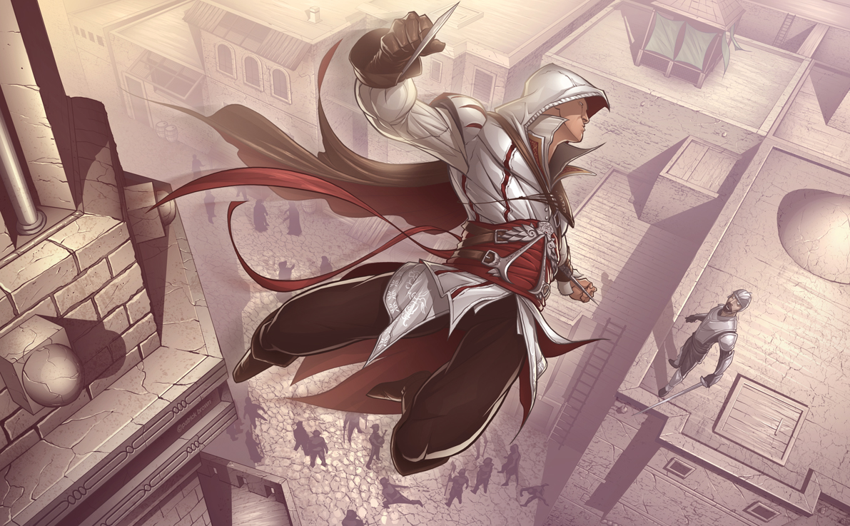
Now this is a great game! I wasn't to sure about it at first because the first got really old too quick.. Very repetitive.
But Assassins Creed II is so much different, it's addictive, enjoyable and impressive!
I just had to make some artwork on it! The first thing that came to my head when brainstorming the scene was a nice high view. It's the best way to portray the game I think, since it's revolved around climbing tonnes of buildings and taking out targets.. I was originally hoping to make him look like an eagle somehow.
The main character Ezio's outfit is awesome too, such an improvement from Altiar's, so it was fun to draw (Wink)")
Anyways enjoy")
- Photoshop CS3
- Wacom Graphics Tablet
- 15-17 hours to create I think..
-Pat
But Assassins Creed II is so much different, it's addictive, enjoyable and impressive!
I just had to make some artwork on it! The first thing that came to my head when brainstorming the scene was a nice high view. It's the best way to portray the game I think, since it's revolved around climbing tonnes of buildings and taking out targets.. I was originally hoping to make him look like an eagle somehow.
The main character Ezio's outfit is awesome too, such an improvement from Altiar's, so it was fun to draw
Anyways enjoy
- Photoshop CS3
- Wacom Graphics Tablet
- 15-17 hours to create I think..
-Pat
Image size
1191x737px 727.76 KB
© 2009 - 2024 PatrickBrown
Comments735
Join the community to add your comment. Already a deviant? Log In
I like this!! As for me, I design RPGs as a hobby!! If you'd ever like to try one, they're on my site scottsnidergames.wordpress.com I don't profit or make any money off deviants, the pleasure my games bring them is my thrill!! Cheers!!